Seller Guide
This document is a guide for sellers who create and operate their own store. It covers the entire process: setting your store address and company details, designing your store, registering products, sending quotes in response to Requests for Quotation (RFQs) you receive, and turning those quotes into projects.
💡 Who is this for? Sales staff who want to expose their export products to external buyers and handle everything in one place — from quote request to quote sending to project/contract. Store operation is handled by someone with the store manager permission.
ℹ️ All seller management screens live inside the main app (
tflowx.com/app/storefront/*). Edit store, where you design the store, opens as a separate window without the sidebar. The public store (store.tflowx.com/<slug>) is where the results become visible to visitors.
1. Getting Started — Access Permissions
The seller management menus appear differently depending on your permissions. The sidebar has two of them.
| Sidebar menu | What's inside | Who Can Access |
|---|---|---|
| Storefront | Store profile · Chatbot · Visitors — designing the store and managing products, categories and media happen in the Edit store window opened from the Store profile | Master or store manager |
| Quotes & inquiries | RFQ Inbox · Inquiries (two tabs on one screen) | All company members |
- To create a store for the first time or to manage products and news, you need store manager permission. If you don't have it, ask your company's Master (→ 10. Assigning a Store Manager). If you open a store screen's address without the permission, you are sent to Quotes & inquiries with You don't have store management permission. Ask your organization master to assign you.
- Responding to quotes (RFQs) and inquiries can be done by any company member, regardless of permission.
- If you have no store yet, the Store profile screen shows a Get started now card with Create Storefront. Choose a store address (slug) and the store is created right away, starting out Inactive. If your company (organization) details are missing, you are asked to register the company in My Profile first.
2. Store Profile — Address, Activation and Company Basics
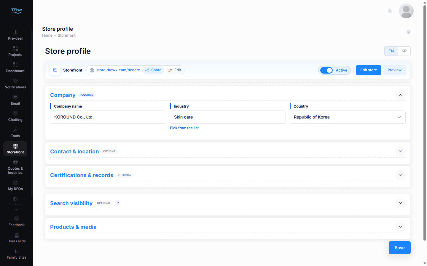
Store profile (tflowx.com/app/storefront, sidebar Storefront › Store profile) is the starting point for managing your store. The top card holds your store address, Share, Edit, the Active switch, Edit store and Preview. Below it come five collapsible cards and, at the very bottom, Save.
| Card | Required? | What you fill in |
|---|---|---|
| Company | Required | Company name · industry · country |
| Contact & location | Optional | Address · email · phone · website |
| Certifications & records | Optional | Certifications · history · export markets · facilities |
| Search visibility | Optional | The title and description shown in search results |
| Products & media | — | Buttons to the Products and Media tabs of the Edit store window |
- Click a card heading to fold or unfold it. Only Company is open at first, and the fold state is remembered in your browser.
- Home layout, theme color, key images, the intro (welcome) screen and the screen preview are not on this screen. They all live in the Edit store window. → 3. Edit Store
2.1 Setting and Changing the Store Address
Press Edit next to the address in the top card and an input box opens. The store.tflowx.com/ part is fixed — you only edit the segment after it.
- Type the address you want and pause; availability is checked automatically, and Available or Already taken appears under the box.
- Press OK (or Enter) and the address is saved on the spot with Store address updated. Press Cancel to leave it as it was.
- Only lowercase letters, digits, and hyphens (
-) are allowed, and it must be at least 3 characters. Capitals turn into lowercase and other characters are not accepted. Too short and you'll see Please enter at least 3 characters for the slug. - Reserved words such as admin, shop, store, api, help, support and pay cannot be used — This slug is not allowed. Please choose a different slug. A single hyphen-separated piece is enough to block it (e.g.
my-shop).
⚠️ If you change the address, the existing public link no longer opens. If you've already shared it externally, get the new link with Share and send it out again.
2.2 Activating, Sharing and Previewing
- Active switch — on is Active (the store is open to visitors), off is Inactive (visitors cannot see the store).
- Share — copies the store link the moment you press it and shows Copied to clipboard; paste it into a messenger or email. While the store is inactive you get This store is currently inactive. Activate it before sharing. The old
tflowx.com/store/...address is no longer used, so always share the link from this button. - Preview — opens the store as visitors see it now, in a new tab. While the store is inactive it does not open and you get This store is currently inactive. Activate it to view. Unpublished edits (the draft) do not show here — use Preview the real page before publishing in the Edit store window (→ 3.1 Saving and Publishing).
⚠️ After flipping the switch, press Save at the bottom of the screen for it to take effect. The switch alone does not open or close your store.
⚠️ While the store is inactive, visitors cannot see it and no new requests for quotation (RFQs) come in. RFQs, quotes, and projects you already have are unaffected.
2.3 Filling in Company and Contact & Location
The EN | KR buttons at the right of the title bar decide which language you are writing in. The screen always opens on EN. Fill in per-language fields by switching between EN and KR; click a field and the value written in the other language appears in small type underneath.
Company (required)
- Company name — written separately per language.
- Industry — click and pick from the list. The Search industries box at the top filters it, and the industry's description appears under the field once picked. If yours is missing, choose Not listed — type your own at the bottom (then it is written per language).
- Country — pick from the list.
- Picking an industry or country from the list fills in the Korean and English names together. They are shown together as
Industry · Countryon the home page's opening section.
Contact & location (optional)
- Address (two lines) · Email · Phone · Website — written per language. Write in EN and leave the field, and any empty KR field gets the same value.
- Once a country is picked, the examples in the address and phone fields follow that country's format.
Both cards take effect when you press Save at the bottom. The company texts on the home page, such as the one-line summary and core capability, are not on this screen — click them in the Edit store preview to edit them (→ 3.8 Editing Right in the Preview).
2.4 Registering Certifications & Records
This is where you list your company's certifications and track record. What you enter here feeds the certification, history, facilities and export-country sections of the home and company pages, as well as the certifications shown on products.
- Certifications — one row per certificate: the name or number (e.g.
ISO 9001:2015) and an issuer (optional). All of them appear as chips, and starred (☆) ones also appear as document cards. - History — one row per date and event. A date shows only as precisely as you enter it:
2023·2023-07·2023-07-15. - Export markets — pick a country in the Select a country box and a row for it appears. Use the next field for a description such as products and the starting year (e.g.
Medical devices · since 2019). Countries already listed, and your home country, are left out of the list. - Facilities — one row per name and value. e.g.
Capacity↔2,000 units/month - Rows are saved the moment you leave a field — there is no need to press Save. Type into the empty row at the bottom to add a new one.
- Drag the handle on the left to reorder, and use the trash icon to delete (you are asked to confirm).
- Certificate names and dates are shared by every language; issuers and event text are written per language.
💡 The certifications you attach to a product are picked from this list. Manage certifications → in the product dialog opens this card for you. → 4. Product Management
2.5 Setting Search Visibility
This decides what title and description your store shows in search engines like Google and Naver. Filling it in well brings more buyers in from search.
- SEO Title — the title in search results, up to 60 characters (e.g.
Kablabs Industrial - Valve Supplier | T flow). - SEO Description — the description under the title, up to 160 characters. One or two sentences on what your company sells.
- The counter under each field (e.g.
49/60) is the current length. The two fields are one set for all languages (switching EN | KR shows the same value). - Press the ? next to the heading to unfold an example of how the result looks. Leave the fields empty and your company name and profile are used instead; the preview shown when you paste the link into a messenger follows these values too.
- Press Save at the bottom for it to take effect.
2.6 Saving — Save and What Comes After
Save at the bottom right saves Company, Contact & location, Search visibility and the Active switch together. The store address (when you press OK) and certification & record rows (when you leave a field) are saved on their own, on the spot.
- After saving you get Storefront updated.
- If your store still has empty spots (key images, certifications, products, core capability and so on), you get Saved — {n} thing(s) still to fill in with a list instead. Saving has already happened; the list tells you what will be left out of the public page until you fill it. Key images are uploaded in the Edit store window › Page tab › the opening (Hero) section (→ 3.6).
- Nothing asks you before you leave the screen. Always press Save after editing.
- In stores that use drafts (a Live badge in the Edit store window's top bar), changes to company name, industry, country, and certifications & records are not published right away. They reach visitors only after you Publish version in the Edit store window; the Pending publish badge next to the company name is the sign. The address, Active switch, contact details and search visibility go public as soon as they are saved.
In the Products & media card at the bottom, Add product → and Add media → open the Edit store window on the Products and Media tabs. → 4. Product Management · 6. Media
3. Edit Store — Designing the Layout and Pages
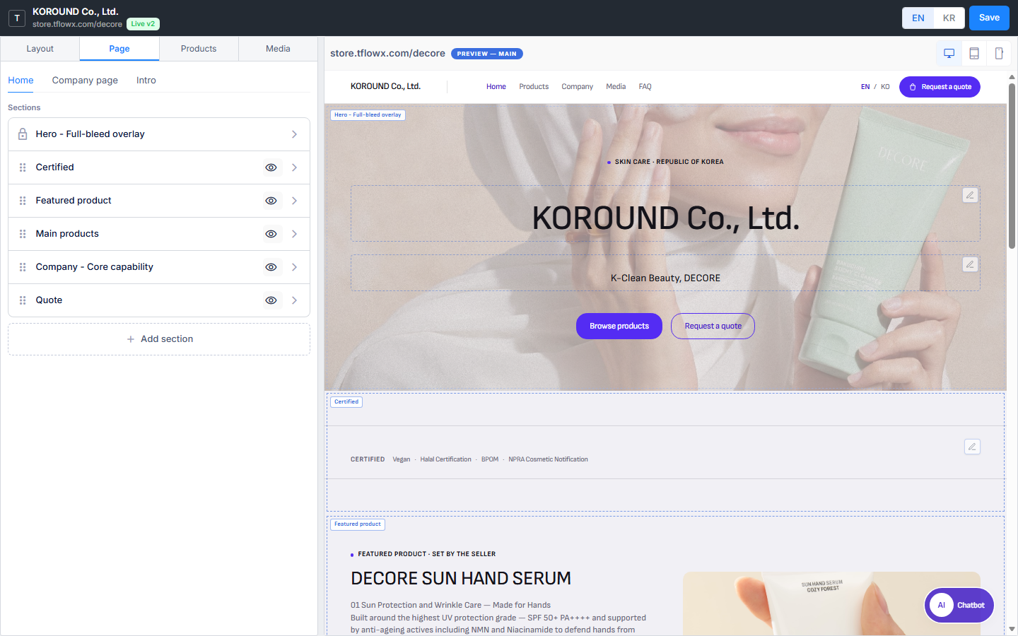
Your store's look (home layout, theme color, section arrangement, opening photo, intro) and its products and media are handled in the Edit store window. Press Edit store in the top card of the Store profile and it opens as a new window without the sidebar.
| Area | What's there |
|---|---|
| Top bar | Company name · store address · EN | KR (the language you are writing in) · Save. Stores that use drafts also get the Live and Draft badges, Preview the real page before publishing (eye icon), Discard draft and Publish version |
| Left tabs | Layout (home layout · theme color) · Page (Home · Company page · Intro) · Products (categories · product list) · Media (post types · posts) |
| Right | The live preview on the Layout and Page tabs; the product list / post list on the Products and Media tabs |
- The window opens on the tab you last used (the Layout tab the first time). Add product → and Add media → on the Store profile open it straight on the Products or Media tab.
- If the window is already open, it is reloaded and brought to the front, so unsaved edits can be lost — press Save first.
- If the browser blocks pop-ups you get The browser blocked the pop-up. Allow pop-ups for this site and try again. Allow pop-ups for this site from the blocked-pop-up icon in the address bar and press again.
3.1 Saving and Publishing — When Visitors See It
Sections, texts, layout, theme and intro settings changed here are kept only when you press Save in the top bar. There is no autosave and nothing asks you when you close the window. Only key images, the intro background image and list rows (certifications, history and so on) save on the spot; photos placed inside a section need Save to stay.
If the top bar shows a Live badge, what you save collects in a draft instead of going public. Once you save, the Draft badge and Publish version appear.
| Badge or button | Meaning |
|---|---|
| Live v2 (green badge) | The version visitors are seeing now |
| Draft r75 (yellow badge) | There are edits that have not been published yet |
| Eye icon | Preview the real page before publishing — opens the draft as the real store in a new tab (tablet and mobile previews open at that size) |
| Publish version | Publishes the draft. Confirm Publish this version? and visitors see it right away. There is no undo button yet |
| Discard draft | Drops everything changed since the last publish. The public page stays as it is |
- Publish version publishes the saved draft — press Save first if you have just changed something.
- Company name, industry, country, and certifications & records edited on the Store profile also go into the draft and need Publish version here.
- Products, categories and media posts go public as soon as you save them, regardless of the draft.
- In a store without a Live badge, Save publishes immediately.
- If sections or blocks are still empty when you save, Saved — {n} thing(s) still to fill in lists them. Empty sections and blocks silently disappear from the public page.
3.2 Layout Tab — Choosing the Home Layout
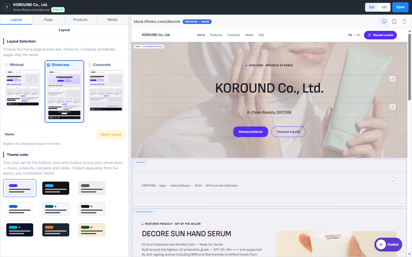
Under Layout Selection, pick one of three arrangements for the home page buyers see. Each card draws its order of sections. The Products, Company and Media pages stay the same.
| Layout | Sections placed on the home page (top to bottom) |
|---|---|
| Minimal | Hero (Split) · Certified · Main products · Company (Who makes it) |
| Showcase | Hero (Full-bleed overlay) · Certified · Featured product · Main products · Company (Who makes it) · Quote |
| Corporate | Hero (Split) · Certified · Main products · Company profile · Media |
- Pick a card. Picking alone does not change the home page.
- Press Apply layout below. If sections already exist you are asked to confirm — the current sections are removed, but your company data (certifications, products, profile and so on) stays; only the arrangement is rebuilt. In a store that uses drafts, if there is no draft yet you first see Create a draft first — press Create draft.
- Press Save in the top bar (and then Publish version in a store that uses drafts) to apply it to the store.
- A section with no data to use (for example Certified when you have no certifications) is not created.
- Apply layout applies to the page you last picked on the Page tab (Home or Company page). The Company page has one default arrangement regardless of the cards — Hero (Company info) · Company (Who makes it) · Certified · History & facilities · Export countries · Location · Quote.
3.3 Choosing the Theme Color
Theme color, further down the Layout tab, is one color set for the buttons, links and chatbot across your whole store (home, products, company and media). It is chosen separately from the layout, and any combination works.
- The first four are basic colors (Default · Dark · Grey · Light).
- The five with an extra dot are industry colors — Medical & Bio, Textile & Fashion, Automotive & EV, Plant & Heavy Industry, Food & K-Food.
- The chips carry no names. Click one and the preview on the right is repainted at once, so compare them by eye.
- Press Save in the top bar (then Publish version in a store that uses drafts) to apply it to the store.
3.4 Page Tab — Working with the Section List
At the top of the Page tab, choose the page to edit: Home · Company page · Intro. The preview on the right switches to that page too. Home and Company page are handled as a section list; the intro is covered in 3.9.
Each row in the section list is one block (section) of your store page, drawn in the same top-to-bottom order.
| Row marker | Meaning |
|---|---|
| ⠿ handle | Drag to reorder |
| 🔒 lock | The Hero (opening) section — fixed at the top of the page, so it cannot be moved, hidden or deleted |
| 👁 eye | Click to hide. A hidden section drops out of the preview and the public page; click again to bring it back |
| Empty badge | A column or block has not been filled in. Hover over it to see why |
| › | Opens the section drawer (clicking the name does the same) |
- Click a row and the preview scrolls to that section. The other way round, click a section in the preview and its drawer opens on the left.
- Close the drawer with the ‹ button at the top left or Esc to return to the list.
- + Add section at the end of the list creates a new section (→ 3.7). A page can hold up to 20 sections.
- A page with no arrangement yet shows a note and Choose in the Layout tab instead of a list. Start with Apply layout on the Layout tab.
3.5 Editing the Sections a Layout Created
Sections created by a layout (Hero · Certified · Main products · Company · Quote …) are frames that draw your company data. Click a row and the left side turns into that section's drawer.
- Change the look — the picture cards at the top of the drawer offer other looks of the same kind. For example Hero Full-bleed overlay ↔ Split, products Main products ↔ Featured product, Company Who makes it ↔ Company profile. A look already on this page cannot be picked, and the change needs Save in the top bar.
- Edit the values — depending on the section, the drawer has fields for its data: key images, industry and country for the Hero; the respective lists for certifications, history, facilities and export countries; Locations rows (place name and address) for Location. Company values you change here are shared across the whole store.
- Texts (company name, one-line summary, core capability, the Quote wording and so on) are edited in the preview, not in the drawer — click the spot. → 3.8
- Product and media sections are filled automatically from the Products and Media tabs. The featured product is set with the star in the product list; without one, the most recently added product appears.
- What you cannot do — these sections cannot be deleted (hiding works), and their names and column layout cannot be changed. For a different arrangement, re-apply a layout with Apply layout, or hide the section and build a new one.
3.6 Uploading Key Images — the Opening Photos
The photos at the top (Hero) of the home and company pages are uploaded in the Key image slots of the Page tab › Home › Hero section drawer. They are saved as soon as they are uploaded, and which slots are used depends on the Hero look you picked.
| Slot | Where it is used | Recommended size |
|---|---|---|
| Main | The photo in the Split hero, and the Company page hero | 1,000 × 620px |
| Wide | The background of the Full-bleed overlay — text sits in the middle, so pick a wide photo with an empty centre | 1,920 × 520px |
| Mobile | Replaces the photos above on narrow screens (1024px and below) | 900 × 520px |
- Each slot has Upload image and Remove, and you can also drop a file on it (JPG · PNG · WebP). Click an uploaded photo to view it large.
- If a slot your Hero look uses is empty, key images show up in the thing(s) still to fill in list when you save. Left empty, that spot goes out blank on the public page.
3.7 Building a New Section — Columns and Components
Press + Add section at the end of the list and an empty New section appears at the end, with its drawer open.
- Columns — it starts with a single Column 1. + Add column splits it into two side-by-side columns (2 at most). With two columns, the trash icon next to the column tabs removes one.
- Components — pick one thing per column: Text · Photo · Video · Table · Map. The matching spot in the preview switches to editing so you can type right away. For a video, put a YouTube or Vimeo link in the drawer's URL field; for a map, type the address.
- Settings sets the height (Auto · Suggested · Max · Custom), how a photo fits (Cover · Contain) and so on.
- Unfold Ready-made components to see sections drawn from your company data (Main products, Featured product, Who makes it, Company profile, Certified, Location, History, Facilities, Export countries, Media and so on). A kind already on the page is not offered. Clicking a card adds that section separately at the end of the list; the empty new section you started with stays behind marked Empty, so delete it with Delete section if you don't need it.
- To switch to a different component, press the block's trash icon — it goes back to empty and the component list returns. Nothing asks you first, so mind anything you typed.
- Section and column titles are typed in the preview (an empty one shows a faint Section title or Column title).
- Delete section at the top right of the drawer removes the section; if it has content you are asked once more.
3.8 Editing Right in the Preview
The preview on the right is the same page as your real store and redraws as you edit. The dashed outlines and name tags on sections only appear in the editor.
- Devices — the Desktop · Tablet · Mobile buttons at the right of the preview header change the screen size. PREVIEW — MAIN / COMPANY / INTRO in the header is the page you are looking at.
- Editing text — editable spots have a pencil (Write) button at their top right. Press it and the spot switches to editing so you can type in place; the eye (View) button in the same place switches back. Only one spot is edited at a time.
- Text: Bold · Italic · Underline · Text colour | Align left · center · right | Auto height
- Table: click a cell and type (Tab for the next cell, Enter for the next row), type into the empty bottom row to add a row, Paste a table copied from Excel in one go, ✕ at the end of a row to delete it, drag the line between columns to set their width
- Photo: drop a file or click to upload (JPG · PNG · WebP, up to 10MB each), Cover · Contain, drag the handle underneath to set the height
- Linked to the left side — click a section in the preview and its drawer opens on the left; a pencil also opens that block's settings. Products · Media in the preview's store menu switch to those tabs, and FAQ takes the main window to the Chatbot screen's Q&A & FAQ tab.
- Language — EN | KR in the top bar sets the language you write in. EN / KO in the store header inside the preview changes only the preview language; text typed then goes into the language you see.
- Text typed in the preview is kept only when you press Save in the top bar.
- The preview cannot be detached or opened in a new window. To see the real page before publishing, use the eye icon in the top bar.
3.9 Turning On the Intro (Welcome Screen)
A full-screen welcome page shown briefly before visitors enter your store. Turn it on with the switch at the top of Page tab › Intro. Left Off, visitors go straight to the home page; turned On, it is shown to each visitor once.
When it's on, fill in:
- Welcome Screen Background Image — covers the whole screen. Recommended 1920 × 1080px · JPG, PNG, WebP · up to 5MB. Saved as soon as it is uploaded.
- Recommended Background — pick White · Blue · Green · Purple · Orange · Dark. It fills the screen when there is no background image.
- Company name · Title · Description · CTA Button Text — for each line, choose show / hide and left · centre · right alignment. Title, description and button text are written per language with EN | KR in the top bar; the company name comes from the Store profile as it is.
- Auto-redirect Wait Time — how many seconds until it moves on to the home page (0 means it never does; 60 at most).
The preview on the right draws the welcome screen (PREVIEW — INTRO), and the eye button next to the switch (Preview the welcome screen) shows it in a separate window. Settings are kept with Save in the top bar.
4. Product Management
Products are registered and edited on the Products tab of the Edit store window. Open it with Edit store on the Store profile, or with Add product → in the card at the bottom. Categories sit on the left (→ 5) and the product list on the right.
ℹ️ There is no products menu in the sidebar. The old address
tflowx.com/app/storefront/productsstill opens; there, categories and the product list sit one above the other on one screen, and adding or editing opens a separate screen.
4.1 Product List
The table shows row number · photo and product name · category · SKU · visibility, with the action buttons at the far right. The first part of the product description sits in grey under the product name. On a narrow screen the category and SKU columns are hidden.
- The box at the top right narrows the list to one category. All and each category name carry the number of products in brackets, and Uncategorized appears when some products have no category.
- Drag rows to reorder them; the order is saved when you drop. Order can only be changed in the All view — while a category is selected the handle is greyed out and reads "Switch to All to change the order".
- The list follows EN | KR in the window's top bar.
- Four action buttons
- Star — the featured product. It appears large on the Showcase home. Only one product per store can be featured; starring another one un-stars the previous product automatically. With none featured, a note appears above the table and the most recently added product takes the featured spot.
- Pencil — opens the edit dialog. Clicking the product name cell (photo, name, description) does the same.
- Eye — switches between visible and hidden at once.
- Trash — deletes after you confirm.
4.2 Adding and Editing Products
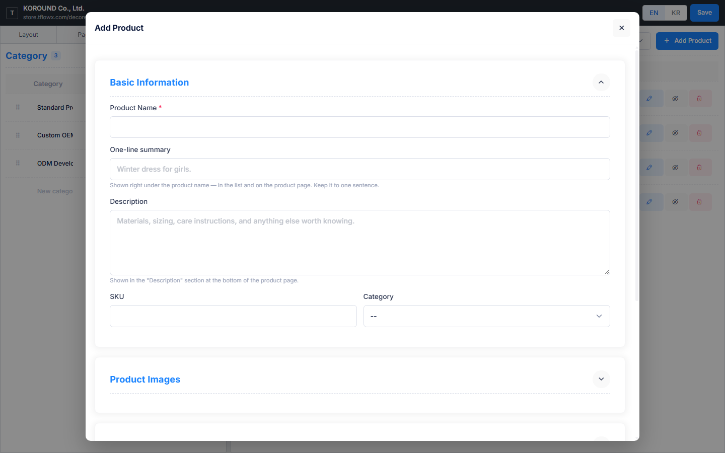
Add Product opens the Add Product dialog (Edit Product when editing). It is split into five sections — Basic Information · Product Images · Trade terms · Specifications · Certifications — and each one folds open and shut when you click its header. Only Basic Information is open at first, and whatever you leave open stays open the next time.
⚠️ Clicking outside the dialog (the dark area) closes it without asking, and anything not saved is lost. When you are done, press Add Product (or Save Changes when editing) at the bottom.
Basic Information
- Product Name (required) · One-line summary · Description · SKU · Category
- The one-line summary is the single sentence shown right under the product name in the list and on the product page. The description is the longer text in the "Description" section at the bottom of the product page. Keeping them separate stops the same sentence appearing twice.
Product Images
- Drag files onto the box or click to pick them. JPG · PNG · WebP, up to 5MB each, 10 files at a time — save first and upload the rest afterwards.
- The first image is the primary one (marked with a star). It is what the home, the product list and the quote cart use, so drag the photo you want to the front. Photos not uploaded yet have a dashed border and go up when you save.
Trade terms
- MOQ (Minimum Order Quantity) · Lead Time (e.g.
4-6 weeks) · Origin · Packaging - Tick Sample Available → buyers can ask for a sample when they send an RFQ.
- Tick In Stock → turn it off and the store shows the product as out of stock.
Specifications
- One row per Key ↔ Details; type into the empty bottom row to add more. e.g.
Material↔Aluminum 6061·Weight↔2.3 kg - Paste — copy two columns (key and details) from a spreadsheet and click it; the rows fill in at once, appended after the rows you already have.
- Drag a row by the handle on its left to reorder. Rows appear in the store exactly in the order you leave them.
Certifications — covered in 4.3 below.
4.3 Attaching Certifications to a Product
The Certifications section of the product dialog has no field for typing a certification name. The company certifications you registered under Store profile › Certifications & records appear as cards, and you click the ones that apply to this product. The count shows as selected.
- If nothing is registered yet, all you see is "No certifications registered yet — add them in Store profile › Certifications & records."
- Manage certifications → opens the Certifications & records card on the Store profile in the main window (→ 2.4). Register them there, then come back and pick. If you have typed anything in the product dialog, save it first to be safe.
- Values attached to this product but missing from the company list (typed by hand before, or removed from the list) are gathered separately and can be dropped with the ✕.
4.4 Per-Language Content and AI Translation
Reopen a saved product and an EN | KO switch appears at the top right of the dialog. The source language is marked source; pick the other one and the form becomes the place to write what that language shows. A brand-new product does not have the switch — save it first to translate.
- Translation runs section by section. Click Translate to KO (or Translate to EN) in a section header and only that section's fields are filled in; afterwards the button reads Translate to KO again. If the source is empty you get Nothing to translate. Write the source text first.
- Once a section is translated its header carries an Auto-translated to KO badge, which turns into KO reviewed after you edit and save it yourself. Change the source later and a Source changed badge appears to tell you it is time to translate again.
- The translate buttons are on Basic Information, Trade terms and Specifications. Photos and certifications are not translated.
- SKU, category, MOQ and stock are the same in every language — one value is used for all.
- Specifications cannot gain or lose rows on a translation tab. Add rows and reorder them on the source tab; on a translation tab you only rewrite the details. Using Paste on a translation tab refills the translated specifications from scratch.
💡 Arabic is not supported yet. For buyers in the UAE and Dubai, filling in the English content completely is the surest option.
5. Category Management
The categories that group your products are created in the Category table on the left of the Edit store window's Products tab. There is no longer a separate categories screen (the old address tflowx.com/app/storefront/categories opens the product management screen with the category block unfolded). Categories are a single level — there is no field for choosing a parent category.
5.1 Creating and Editing Straight in the Table
There is no Add Category button. The cells in the table are the input fields.
- Type a name into the empty row at the bottom (New category name · Description (optional)) and it becomes a new category. A fresh empty row appears underneath, so you can keep adding one after another.
- Edit an existing row by clicking its cell. It saves when you stop typing or leave the cell, with a spinner in the product-count column while it saves. There is no Save button to press.
- Enter saves the cell and moves you to the next one.
- A name is required. Leave it empty and the row shows "Category is required"; reuse a name and it shows "A category with this name already exists". Names that differ only in capitals or in leading and trailing spaces count as the same name — and so do an EN name and a KR name that match.
- The table holds Category · Description · Products · Actions.
5.2 Language, Order and Deletion
- EN | KR in the window's top bar decides the language you are writing in. Each language is stored separately and buyers see the name in their own language. Filling in only one of them is fine.
- Drag the ⠿ handle on the left of a row to reorder. That order is the order categories appear in your store. A row that has not been saved yet has no handle.
- A category with no published products does not appear in your public store. The same goes for a category that only holds hidden products; add one published product and it shows up again. (The product count in the table includes hidden products, so a count of 1 or more does not guarantee the category is visible.)
- A category that holds even one product cannot be deleted. The trash button is locked and reads "Cannot delete — N product(s) are in this category". To remove it, move those products to another category (or clear their category) in the product list on the right first.
💡 Only the categories you create here appear in the Category list of the product dialog. Create your categories before you add products.
6. Media — Posting News to Your Store
News is posted on the Media tab of the Edit store window. Add media → in the card at the bottom of the Store profile opens this tab directly. What you write here appears under the Media menu at the top of your public store (store.tflowx.com/<slug>/media). Press coverage, new product introductions, trade show news, promotional videos — this is where you show buyers what the company is doing right now.
ℹ️ There is no media menu in the sidebar. The old address
tflowx.com/app/storefront/postsstill opens (titled Media Management); there, writing a post opens a separate screen.
6.1 What the List Shows
The table holds Cover · Title · Status · Published · Views · Actions. The cover column shows a small cover photo, and under the title you get a post type badge and the author, plus a Featured badge on the post you have featured.
- In the Post type list on the left, choose All or one of Press · Blog · Video (the number beside each is its count). If the type you picked has nothing in it, you get No posts of this type yet.
- The three statuses are Published · Scheduled · Draft. For a scheduled post the publish-date column shows the scheduled time instead.
- Click the star in the actions column to set the featured post — it becomes the large card at the top of your store's Media page. The star only appears on published posts, and a store can have only one, so starring another post automatically un-stars the previous one.
- Edit or the title opens the edit dialog; the trash icon deletes after you confirm.
6.2 Writing a Post — Pick the Type First
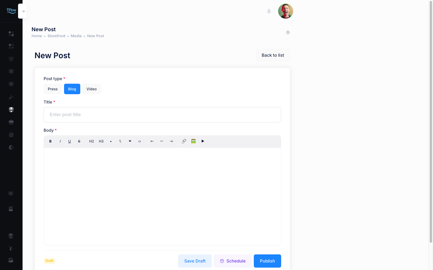
New Post opens the New Post dialog. Start with Post type (required) at the top — a new post has Blog selected. The fields below change with the type, so switching later leaves new blanks to fill.
| Post type | Extra fields beyond title and body |
|---|---|
| Press | Publication (required) · original article URL |
| Blog | none |
| Video | Video URL (required) · duration · cover image |
- Title and body are required for every type. The body editor handles bold, headings, lists, quotes, alignment and links, and can hold photos and YouTube videos. Tables cannot be inserted.
- Only YouTube and Vimeo links can be embedded as the video URL. If you have no link, Upload file takes a video file (MP4 · WebM · MOV) directly — but only up to 20MB. Over that you get The file is over 20MB. Use a YouTube link for larger videos.
- Uploading a video file fills the cover photo and duration automatically (empty fields only) and shows Cover and duration were taken from the uploaded video. Keep them or change them. Videos the browser cannot open are skipped.
- The cover image is normally picked from the photos in your body text. Video posts can also upload a cover image — JPEG, PNG or WebP, up to 5MB. Without a cover the card in the list stays an empty grey box.
- The buttons at the bottom are Save Draft · Schedule · Publish. Publishing puts the post on your store immediately. On an already published post, Save replaces Publish.
- Clicking outside the dialog (the dark area) closes it without asking, and anything not saved is lost.
6.3 Showing the Post in Another Language
Reopen a saved post and a Translations card appears below the form. A new post that has never been saved does not have one — there is nothing to translate yet.
- The card shows the source language at the top, with one row for each other language (Korean · English · Japanese · Chinese).
- Press Translate and the title and body are filled in with an Auto-translated badge. Edit the wording in View / edit and Save as reviewed, and it becomes Reviewed, so auto-translation will not overwrite it afterwards.
- Edit the source afterwards and a Source changed badge appears to tell you it is time to translate again. Translating a reviewed or locked translation again asks you before overwriting it.
- Delete a translation and visitors in that language see the source language instead.
6.4 Making Posts Visible on Your Store
A published post appears on its post-type tab (Press · Blog · Video) under the Media menu of your public store.
- The three tabs are on by default, and a tab with no posts is hidden automatically, so an empty page never reaches visitors or search engines.
- Scheduled and Draft posts do not appear on the store.
- There is currently no screen for renaming or reordering the tabs or switching them off.
6.5 Scheduled publishing
You can write a post ahead of time and have it go live automatically at the moment you choose.
- In the post dialog, click Schedule to open the Publish at field (default: 9:00 AM tomorrow).
- Pick a time and click Schedule It — the status changes to Scheduled.
- At the chosen time the post publishes itself and appears on your store's Media page.
- The time follows the time zone of the device you are on, and that time zone is shown next to the field. If you connect from abroad, that local zone applies.
- A scheduled post stays hidden from buyers until it publishes. The publish-date column shows the scheduled time instead.
- To undo a schedule, open the post and click Cancel Schedule — it returns to draft.
- To move a schedule, pick a new time in the edit dialog and click Schedule It again.
- To skip the wait, click Publish — the schedule is dropped and the post goes live at once.
7. From the RFQ Inbox to Sending a Quote
Quote requests sent by buyers arrive on the RFQ Inbox tab of Quotes & inquiries (tflowx.com/app/storefront/rfqs) in the sidebar. Here, when you compose and send a quote, a project is automatically created.
When a new RFQ arrives, email and in-app notifications are sent to all company members.
💡 Subscription (license) and RFQs — Creating a store, registering products, and publishing work without a subscription, but viewing buyer identity (company, contact, email, phone, message) on received RFQs and responding (status change, assignee, writing/sending quotations) require one. Without a subscription, buyer information appears 🔒 masked in the list and details (items and shipping terms remain visible), and pressing the quotation button shows a subscription prompt. → License
7.1 The RFQ Inbox List
List table: RFQ # · buyer · items · status · received · actions Status flow: New → Reviewing → Drafting quote → Quote sent → Buyer accepted (Declined if you decline)
- Drafting quote — Create Project & Quotation has created the project and the Quotation (QT), but it has not been shared with the buyer yet.
- Quote sent — You approved and shared the quotation from the project's documents, so the buyer can see it.
- Buyer accepted — The buyer has given final acceptance to the quotation.
Press Detail to open one and work through it.
- Buyer info and internal assignee assignment
- Requested items (product, quantity, sample request, notes)
- Shipping details (destination country, port, Incoterms, target lead time)
- Actions: Write quotation (available for new requests too — the status changes to Reviewing when you first save) → after quoting, go to Project
🖼️ Screen capture RFQ inbox list + detail modal 📍
tflowx.com/app/storefront/rfqs· Save locationimages/store/seller-rfq-inbox.png
7.2 Composing a Quote
Clicking Write quotation, or a request row in the list, opens the Quotation (QT) form — the same form as the quotation in a project's documents.
- When it first opens, your company info and bank, the Incoterms and destination the buyer wrote in the RFQ, and the requested items and quantities are already filled in.
- The other empty fields (payment terms · shipment timing · packing · origin · notes · validity · currency) are filled from your company's Quotation Default Terms. The buyer's terms come first.
- In the Shipment row, answer the buyer's target lead time. Example: Within 30 days after receipt of deposit
- Enter unit prices and the total is calculated automatically. You cannot continue while the total is 0.
- Actions: Save Draft or Create Project & Quotation (enter a project name)
7.3 Quote → Auto-Creation of Project + Quotation (QT)
Clicking Create Project & Quotation triggers all of the following at once.
- A sales/export project is automatically created, with the seller as owner.
- The buyer is added to the project (the buyer is notified when you share the quotation).
- The corresponding RFQ status changes to Drafting quote and is linked to the project. The buyer cannot see the quotation yet — once you approve → share it from the project's documents, the status becomes Quote sent.
- The composed quote is turned into a Quotation (QT) document in the project's document library.
- The buyer's request is kept as a Request for Quotation (RFQ) document as well — a read-only copy of the items, quantities, requested terms, and message, so you can always look back at what was originally asked inside the project.
After sending, the quote screen becomes read-only, and you can navigate via Go to Project / Open Quotation (a deep link to the QT document).
💡 Subsequent terms negotiation proceeds by exchanging this QT document (a document handshake). The quote effectively becomes the starting point of the project.
An inquiry is separate. A free-text 1:1 message — no products or quantities attached — is handled as a conversation in Inquiries, and it never turns into a project. → 8. Inquiries
8. Inquiries — Handling 1:1 Messages
Inquiries (tflowx.com/app/storefront/inquiries) is where free-text 1:1 messages buyers send from your store land. It is the second tab of the Quotes & inquiries screen in the sidebar, next to the RFQ Inbox. Unlike a quote request there are no products or quantities attached, and nothing becomes a project — all you exchange is conversation.
🔒 Reading and replying to inquiries requires a subscription (license). Without one you get an Available with a subscription lock screen and a Go to subscription button instead of the list. Sending an inquiry is free for the buyer. → License
8.1 The Inquiry List
The table holds buyer · subject · last message · status · actions, with the buyer's email under their name. Click anywhere on a row, or press Open, to go to the detail view.
- The Status box at the top right narrows the list to All · Open · Replied · Closed.
- Twenty inquiries fit on a page; beyond that, Previous · Next appear underneath.
- With nothing received yet you only see No inquiries received yet.
8.2 Reading and Replying
Open an inquiry and the card at the top shows the subject, the buyer's name and email, and the time of the first message, with a status badge on the right.
- Below it the conversation runs as speech bubbles: the buyer's messages on the left, your replies on the right, each stamped with sender and time.
- Type in the Reply box at the bottom and press Send — it is appended to the end of the conversation. The button stays disabled while the box is empty.
- Opening an inquiry marks it as read automatically. There is nothing to press.
- ⚠️ A closed inquiry has no reply box. In its place you get This inquiry is closed. You can no longer reply.
9. Visitors (Store Analytics)
Check your store's visits, behavior, and conversions in Visitors (tflowx.com/app/storefront/analytics, sidebar Storefront › Visitors). Choose the period as 7 days / 30 days / 90 days.
- Summary cards: Visitors (unique) · Views · Cart adds · RFQ + conversion rate
- Purchase funnel: Step-by-step conversion rates for Added → RFQ sent → Quote responded → Project conversion
- Currently open carts: Products visitors have added right now (only what was added — who added it is not shown)
- Daily trends: Line chart of views and cart adds
- Top products / Top products added to cart
- Traffic channels: Which path (UTM) visitors came through
🔒 Privacy: Analytics does not show personally identifiable information. It is provided only as anonymous aggregates.
🖼️ Screen capture Seller analytics — summary cards + purchase funnel + traffic channels 📍
tflowx.com/app/storefront/analytics· Save locationimages/store/seller-analytics.png
10. Assigning a Store Manager (Organization Settings)
Store manager is a role that can operate and manage the store. The company Master assigns it in the store manager section within My Organization (organization settings).
- In the organization settings screen, open the store manager section.
- Add a manager by entering their email (they must be a member belonging to the company).
- The designated member gains access to the whole Storefront menu in the sidebar (Store profile, Edit store, Chatbot, Visitors).
- To remove them, delete the manager from the list.
💡 Role division: Storefront (store profile, design, products, media, chatbot, analytics) is handled by the store manager, while Quotes & inquiries (responding to RFQs and inquiries) is handled by all company members. This is useful when you want to run content staff and sales staff separately.
💡 Troubleshooting (FAQ)
Q. I can't see the "Storefront" menu in the sidebar. A. You need store manager (or Master) permission to see it. Ask your company Master to assign you as a store manager in the organization settings. Quotes & inquiries (RFQ Inbox · Inquiries) is visible regardless of permission.
Q. I saved, but my store looks the same. A. In a store with a Live badge in the Edit store window's top bar, what you save collects in a draft; press Publish version to show it to visitors (→ 3.1). A layout card does nothing on its own — press Apply layout, then Save.
Q. Nothing opens when I press Edit store. A. The browser blocked the pop-up. Allow pop-ups for this site from the blocked-pop-up icon in the address bar and press again.
Q. Where do I change the key images and the welcome screen? A. Both are on the Page tab of the Edit store window: key images in the Home › Hero section drawer (3.6), the welcome screen on the Intro tab (3.9).
Q. What happens to old links if I change the slug? A. The existing links won't open, and access is only via the new slug. If you've shared a link externally, get the new link with Share and re-share it.
Q. My product image exceeds 5MB and won't upload. A. Images can be at most 5MB per file. Before uploading, use an image compression tool to reduce the size or lower the resolution and try again.
Q. The category list in the product dialog is empty. A. You must first create categories in Category Management for the options to appear.
Q. I sent a quote but no project was created. A. If you only use Save Draft, no project is created. You must click Create Project & Quotation, enter a project name, and confirm for the project, QT document, and buyer invitation to all be created together.
Q. The currency I want isn't available for quotes. A. Currently USD / EUR / KRW / AED / JPY / CNY / GBP are supported. For other currencies, specify the conversion basis in the remarks (Terms) and negotiate.
Q. If I turn the store inactive and back on, will my analytics/RFQs disappear? A. No. Making it inactive only blocks exposure; your existing RFQs, quotes, projects, and analytics data are preserved as-is.